 back
backMedium Design Collective
Medium Design Collective, UI/UX Designer
Fall 2016 - Fall 2017Reimagining Medium’s site to better reflect the brand and message.
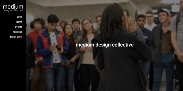
The old site
Medium’s branding is largely monochromatic with CMYK "pops" of color. However, the web team felt that the existing website was not very representative of Medium’s message and purpose. Through our events, we found that there was a significant amount of visual content in our archives that was being underutilized.
The original website is below.
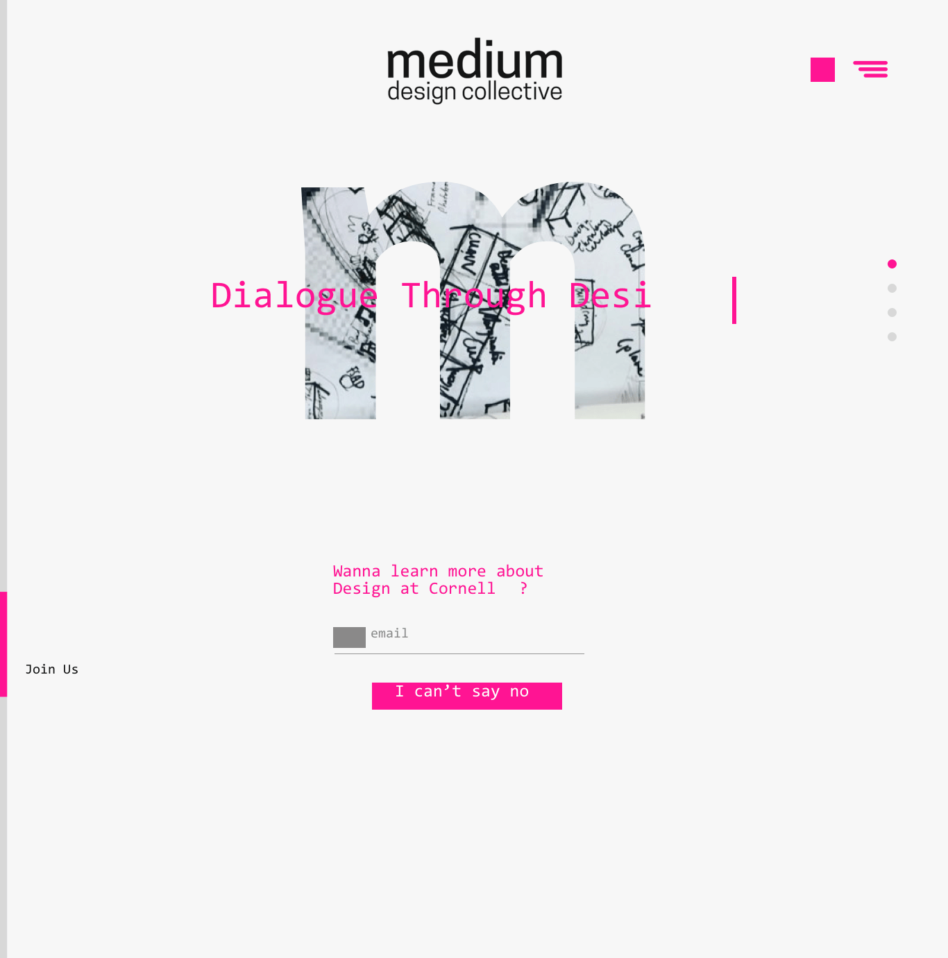
The new site
We redesigned the site to better use our assets and tell a visual story about our organization.
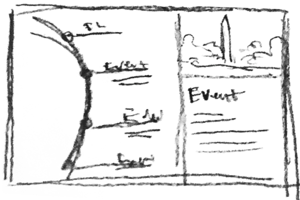
When we came to our events page, we wondered: how can we showcase both past and upcoming events? Our solution was to build a wheel that initially landed the user at the nearest upcoming event, but allowed them to scroll into our history. See it in action here!
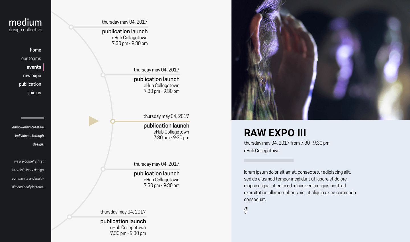
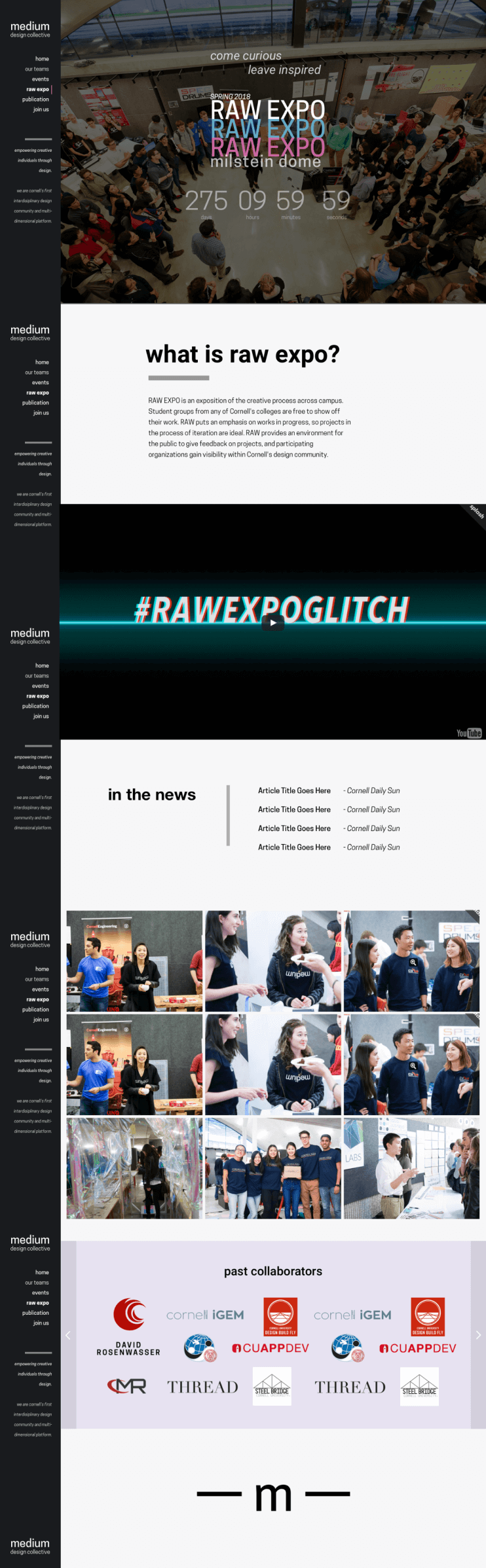
We also needed a page to exhibit our signature event, RAW Expo. This first iteration for our initial launch is shown below. The most recent iteration is here.