 back
back
While I was an intern at FactSet, my project was to build a complete Figma library of design system components in the existing system.
Demo Video
I created a quick five minute video to explain some context & demo the component library. I walk through a tutorial of how to use the library (& some handy Figma features) and break down how some of the components were built.
A Period of Transition
When I joined as a UX Design Intern the summer of 2018, the team was switching from Adobe Fireworks to Figma. The team had already begun to make the switch, but new software meant every component had to be built from scratch every time. This is where I came in!
Atomic Design Principles
We researched and based our system off of the principles of Brad Frost’s Atomic Design. I also did a deep dive of well-known design systems like Google’s Material Design, IBm’s Carbon Design, and other well-known systems for inspiration.
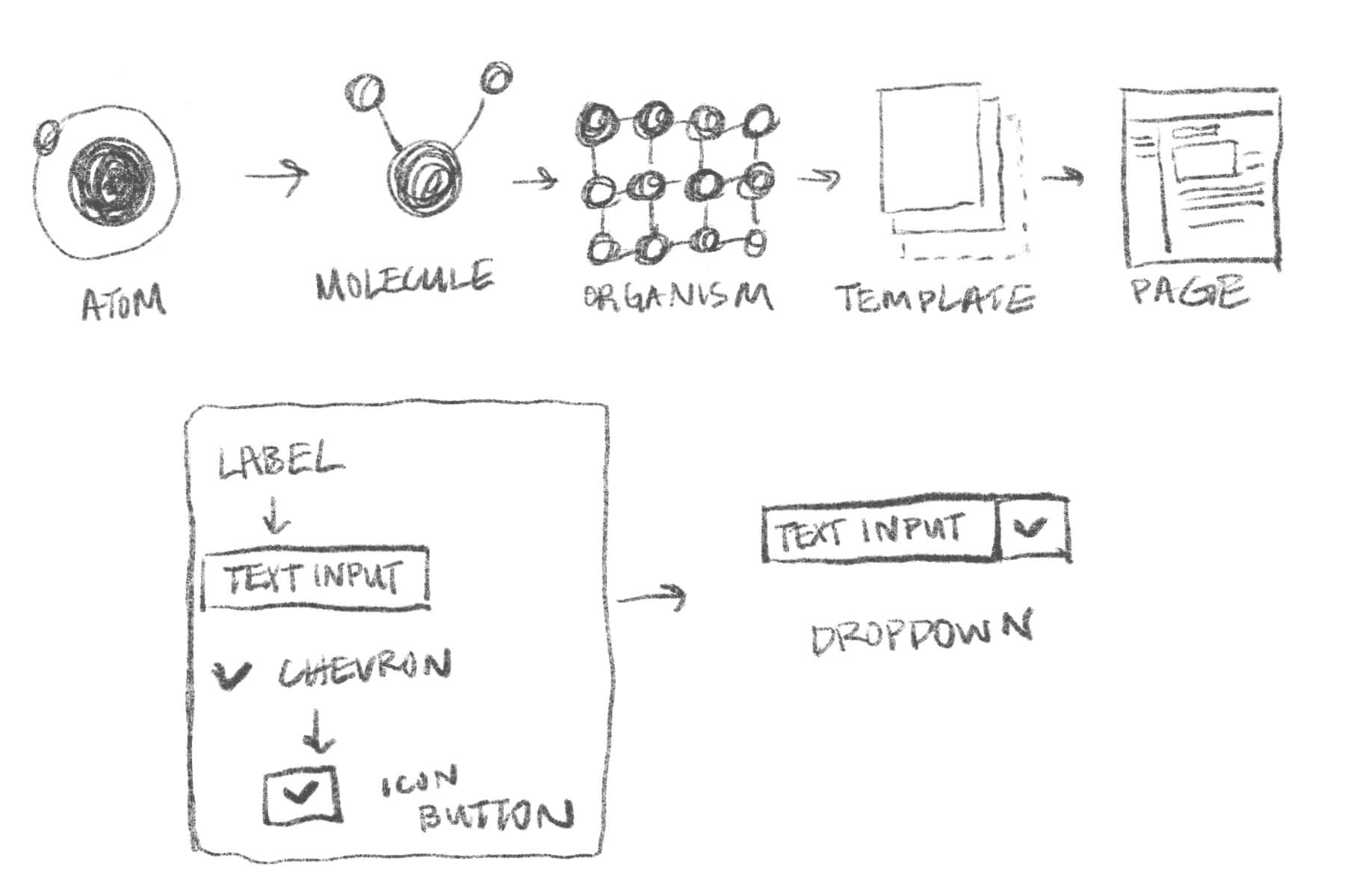
As a team, we began breaking down each component of our library and mapping components to each level of organization and determining which components were more complex and could be built out of smaller atoms or molecules.
Some logistical questions we tackled during this phase of planning included: how do I group components intuitively? What kind of naming conventions do I use to become the team standard? How granular should each atom be? (E.g. is the background of a button too specific of a component? What about a text label?)
We worked in conjunction with our frontend engineering teams to create a more standardized, dynamic process than the manual labor that existed before.
Before autolayout and variants existed...
Nowadays Figma has all kinds of crazy features for responsive and flexible components. At the time, we were limited to using a combination of constraints, grids, and nested frames & components.
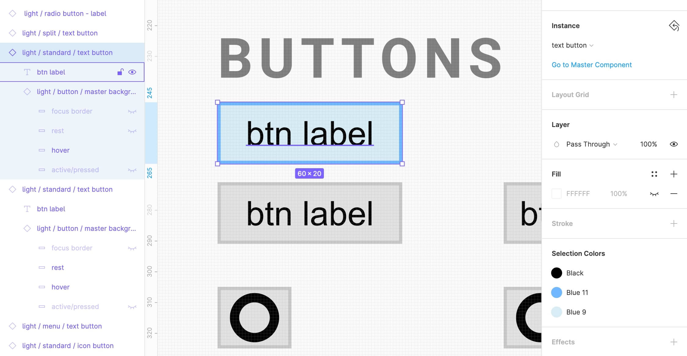
Example: states
Each component had multiple states — what happens when I want to mock something with a hover state? For this (and many other variable pieces), I used the power of Figma’s nested components. Nested components allowed each state (hover, active, disabled, focus, etc.) to be built into the layers of an individual component. I referenced this article by Thomas Lowry as a basis.
Results
By the end of my internship, the "atoms" and "molecules" had been built into the component library in full. The most frequently used "organism" UI patterns had also been integrated into the library and demo. Many more complex patterns could be built by mixing and matching.
The visual design team began integrating these components into their daily workflow. Some of my biggest challenges came from understanding how components were used on the platform as well as how the visual designers build them, then integrating this thinking into my system designs.
Takeaways
I learned a good deal about systematically creating a reliable and reusable component. Moving forward the team’s primary objectives were to work further with our developers to implement the actual system in a streamlined, scalable way. Regretfully, my internship came to a close at this point and I was unable to accompany them in the next stages!
If you’re interested, you can check out the demo file in Figma.
Now I do this full time!